Module SIX – Chapter 9 – DESIGN DEVELOPMENT FOR FINAL WALLHANGING
My tutoring with Sian at Summer School was extremely useful, and has given me much food for thought and a great help with points to consider to make progress with design.
THE FIRST QUESTION WAS ABOUT COLOURS. Was I really sure my coloured papers do reflect my pictures and my conservation theme - the Tiber river and its conditions of neglect? No, I was not sure, I rather feel now that they are too bright and strong and not truly in line with the Tiber river as seen in wintertime with its deserted and lonely banks scattered with naked branches, rags and wastes.
I still like the blues and greens as main hues and relooking at my pictures and at my original colour palette I went back at my papers and gave them a few watery washes slightly tinted with brown, yellow and black in order to dull and tone down all that flashiness a bit. I now have a new set of colours that are still not gloomy but which I feel can express my theme better.
Original colour palette and pictures of the river arranged around it
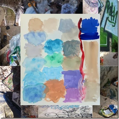
I put together a photo collage of some newly recoloured papers using Paint Shop Pro just to get an overall feeling.
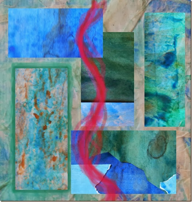
I also thought that as a contrasting hue I rather prefer a reddish colour instead of an orangey one, I see this red at the centre as a wound or a scar running through the river. This idea was floating on my mind as I took the pictures last winter because of a recent tragic event which happened there and also came back to me during summer school. It has strong associations with what I feel about the river and also a personal meaning I would like to give flesh to.
Photo collage of coloured papers after treatment. The crimson red line is digitally painted.
This read line also runs through some of my summer school samples and I add them here just as a reminder to me during designing.


I am specially drawn to the sample on the left because it reminds me of waves: it is a flat cylinder of cut and slashed papers.
The red line leads me to another question that came up with Sian in connection with my conservation theme: WHICH ASPECTS OF THE TIBER RIVER THEME AM I GOING TO DELEVOP?
I have set up a list of aspects based on my photographs and my feelings. At this point they are just possibilities and very probably not all of them shall be taken into account and further developed:
WATER AND WAVES – their shapes and directions
NAKED BRANCHES OF TREES GROWING OUT OF THE WATER OR BESIDE THE RIVER
RAGS, PLASTICS AND WASTES ON BRANCHES AND ON THE BANKS
BRIDGES SPANNING THE TIBER AT MOSTLY REGULAR INTERVALS AND FERRYBOAT PIERS - the hard rigid structures in iron and stone contrasting with the fluid water and fragility of branches, etcetera
MULTI-LAYERED STRUCTURE OF THE RIVER – seen from below the bicycle path, the river, the embankments, the streets with cars, the buildings on top
GRAFFITI ON THE BANK WALLS - similar to an embroidery
WOUND OR SCAR THROUGH THE RIVER – this is visible only to my inner eye
I have also reread the words/sentences I have written alongside my black and white papers of the design exercise of Chapter 8. This is a choice of personal words/sentences written at the time that I now feel most relevant or meaningful to me:
WORLD BELOW, ENVELOPED, RESTFUL, GENTLE
IMPRISONED AMONG BRANCHES, FRAGILE CASES
DO NOT THINK TOO MUCH, USE WHAT YOU CAN
DELICACY OF THINGS HALF FORGOTTEN
SOFTLY REMEMBERING IN THE SHADE OF YOUR HEART, IN THE WARM PLEATS OF YOUR SOUL
STRONG ROOTS, TRUST YOUR STRONG ROOTS
Keeping all these suggestions in mind I went back to my coloured small designs - they measure around 10-15 cm on each side - and selected those which appeal to me and seem most akin to at least some aspects of the Tiber I am interested into.
It is a shame that the colours do not feel right anymore but they are just a starting point anyhow:
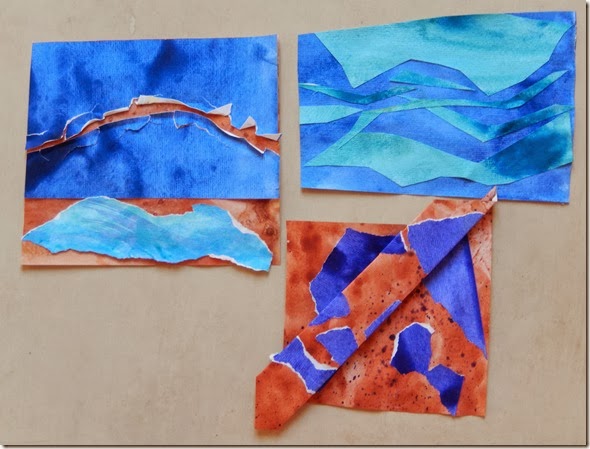
In the three of them as a whole I see the wound or scar, the world below, the bridges on top, the flowing of water inside the banks.
I am also thinking of this satellite image of the Tiber that I found on the web, I like the beautiful winding movement of the river.

The three new coloured samples are longer than the old ones, reflecting the shape of the river, and measure approximately 30 x 15 cm each. Colours are more muted since I used the newly coloured papers.


I developed a second set of designs from the first ones, which are approximately double in length, so they are around 60 cm long and 15 cm tall.

Design sample ONE: developing only the length
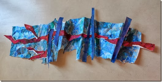
Design sample TWO: length plus folding (more layers) and crossing lines (bridges)

Design sample THREE: more movement and variety along the water

Design sample FOUR: holes in the bottom and holed structures on the vertical plane to suggest shadows in the water and building structures in 3D
I am going to think all this over during the weekend and come back next week with hopefully fresh eyes.

You have loads of work and possibilities here,could keep you going a long time! I like the red line and think design two and design three are especially strong.
ReplyDeleteWow! You certainly have put a lot of thought into this project, Daniela, I like your thought processes, pushing this piece onwards. I like design 3 and also the paperwork sample in the 4th pic down from the top.
ReplyDeleteLooking forward to seeing where you take this from here.
Wonderful ideas Daniela! I'm getting quite excited to see your finished work.
ReplyDelete