Her face is a map of the world. Mapping faces
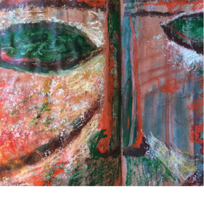
I have recently discovered the British expression 'her face is a map of the world' here . To me it means that a face takes on itself the imprint of life. Every day our face changes with us reflecting the passage of time, our experiences and feelings. Looking at faces like maps really inspires me and I have drawn a series of sketches within the frame of my theme of masks and faces. Tactile self portraits 'Her face is a map of the world' makes me think that we can read a face like a map. I can explore its individual marks, lines, folds and wrinkles like a territory I am exploring. And this was exactly what I had in mind while I was sketching the tactile self portraits below. Tactile self portraits are a fascinating exercise included in one of my favourite books on drawing ever - Drawing Projects by Mick Maslen and Jack Southern. As I told in my latest post, Sian Martin warmly recommended this book to me years ago when I started the course. Unfortunatel