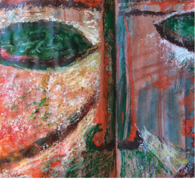
Module Five – Chapter TWELVE – REVISED PROPOSAL FOR MY FACE

I have been revising my face design after receiving this particularly helpful comment from Sian:
“Design features – You have simplified the shapes within the original design ideas so that they have become simple areas to fill with texture. The mock-up design presented alongside Sheet Two is a more symmetrical design than the one in your initial line drawing and the more developed line drawing to the left of the mock-up. I feel this would give it a more individual character than the symmetrical design.”
I thought it over and decided to go back to my original line drawing and try to make good use of its asymmetry as suggested by Sian.
Stage 1: initial line drawing

Stage 2 – Development of initial drawing into a face design

This was my previous development into a face or mask. I thought it better to maintain all lines of the initial drawing and so I opted for inscribing a face within its contours instead of around them.
I also decided to follow the nose ridge more faithfully and add a mouth hint along the same line. Now I have one eye only and this eye is connected to the front ridge and not “floating” below it. The face emerges from a background or frame instead of standing alone.

Sian’s feedback also included a very stimulating and useful exercise to originate design permutations of original shapes.
I used my flat textured papers to try different effects on the same design, varying relationships between face and background and light and shade areas.

My choice for further development falls on number 5 since I like the idea of contrast between face and background instead of “losing” the face in it and I prefer to have the smaller half of the face in shadow.

Stage 3 – New paper mock up
For my second attempt I opted for relief papers. I used three different textures to translate the seven original areas of design. The face areas are placed on three levels, the shade area is recessed and flat, the light area is slightly raised and the front area with the eye is further raised on it. The background has been split and moved a bit to let the face breathe. In the mock up both halves of the background are flat, but maybe the left half might be slightly raised. I am going to decide this later on.
All areas are floating on sheets of acetate to keep them together and I would like to keep this transparent effect in my resolved sample but I am still open to other solutions. The mock up has been taped on a window to show its see-through structure as best I can, the profile view hopefully makes the three levels clear enough.


A very happy Easter to everybody!!!
“Design features – You have simplified the shapes within the original design ideas so that they have become simple areas to fill with texture. The mock-up design presented alongside Sheet Two is a more symmetrical design than the one in your initial line drawing and the more developed line drawing to the left of the mock-up. I feel this would give it a more individual character than the symmetrical design.”
I thought it over and decided to go back to my original line drawing and try to make good use of its asymmetry as suggested by Sian.
Stage 1: initial line drawing

Stage 2 – Development of initial drawing into a face design

This was my previous development into a face or mask. I thought it better to maintain all lines of the initial drawing and so I opted for inscribing a face within its contours instead of around them.
I also decided to follow the nose ridge more faithfully and add a mouth hint along the same line. Now I have one eye only and this eye is connected to the front ridge and not “floating” below it. The face emerges from a background or frame instead of standing alone.

Sian’s feedback also included a very stimulating and useful exercise to originate design permutations of original shapes.
I used my flat textured papers to try different effects on the same design, varying relationships between face and background and light and shade areas.

My choice for further development falls on number 5 since I like the idea of contrast between face and background instead of “losing” the face in it and I prefer to have the smaller half of the face in shadow.

Stage 3 – New paper mock up
For my second attempt I opted for relief papers. I used three different textures to translate the seven original areas of design. The face areas are placed on three levels, the shade area is recessed and flat, the light area is slightly raised and the front area with the eye is further raised on it. The background has been split and moved a bit to let the face breathe. In the mock up both halves of the background are flat, but maybe the left half might be slightly raised. I am going to decide this later on.
All areas are floating on sheets of acetate to keep them together and I would like to keep this transparent effect in my resolved sample but I am still open to other solutions. The mock up has been taped on a window to show its see-through structure as best I can, the profile view hopefully makes the three levels clear enough.


A very happy Easter to everybody!!!


This is very exciting Daniela!
ReplyDeleteWhat a fabulous interpretation of the original art work, Daniela, I love the 3D effect of the separate pieces, looking forward to,seeing where you take it from here.
ReplyDeleteThese look really wonderful, Daniela. It's so interesting watching someone else's thought process, stimulating too.
ReplyDelete