Module Five – Chapter TWELVE – IDEAS FOR A RESOLVED SAMPLE: A FACE OR MASK


THOUGHT PROCESS BEHIND MY IDEA FOR A RESOLVED SAMPLE
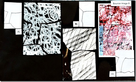
Looking back at my line drawings and landscape designs from Chapter 11 together with their source images my attention has been caught by line drawing B) from image 9.

It has immediately made me think of a face or mask and my next association has been: a face is somehow a landscape with its hills and valleys – front, eyes, cheeks – and its changes and marks left from the passing of time which remind me of wrinkles and other signs of age. And I think it might be interesting to use some manipulating techniques learnt in this Module to translate these different reliefs and marks in fabric.
Stage 1 - Initial line drawing chosen as basic design idea
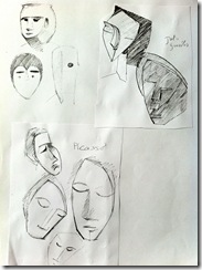
My chosen line drawing has only three areas and to get a first feeling of what I wanted to do I have made some rough sketches of faces and masks found in art books which I find have some connection with my design idea.


B line drawing is my foremost inspiration with its three bold areas but also the crayon marks on both designs on cardboard and textures shown on the related source image 9 may offer useful suggestions for surface treatments at a later stage.

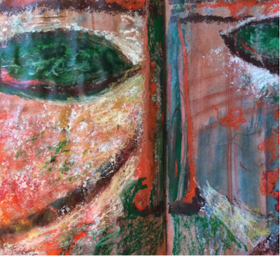
Stage 2 – Development of design idea into a face or mask, with the addition of smaller areas for the eyes, positioning of the nose along the vertical ridge and separation between front and lower face along the horizontal ridge. No mouth is added.

And this is my paper mock up based on above design.

Stage 3 – Paper mock up (37 x 22 cms at the outmost edges). The eyes are left half opened, the nose ridge divides the lower face into two halves.
All these materials have been arranged on two sheets of my portfolio as shown here. The real paper mock up is kept separately, on the portfolio there is only a photo.
Sheet ONE

Sheet TWO


This looks like a great start and I love the look of the 3D mask.
ReplyDeleteLooking forward to seeing where you take this.
This is looking really exciting. Looking forward to the next steps.
ReplyDeleteA fascinating idea Daniela and I love your paper mock up. I love the thought of the face as a landscape!
ReplyDeleteThis is wonderful work Daniela. I'm looking forward to seeing how this turns out.
ReplyDeleteSorry to be so slow leaving you a comment. Your mask is such an interesting take on landscape. Did you make a connection with Roman Carnival? I'll be really fascinated to see the next stage.
ReplyDelete